Help Me Choose
Helping customers find the right chequing account through a guided experience.
Role
Scope
Product Designer
End-to-end
3 months
Live
Status
Timeline
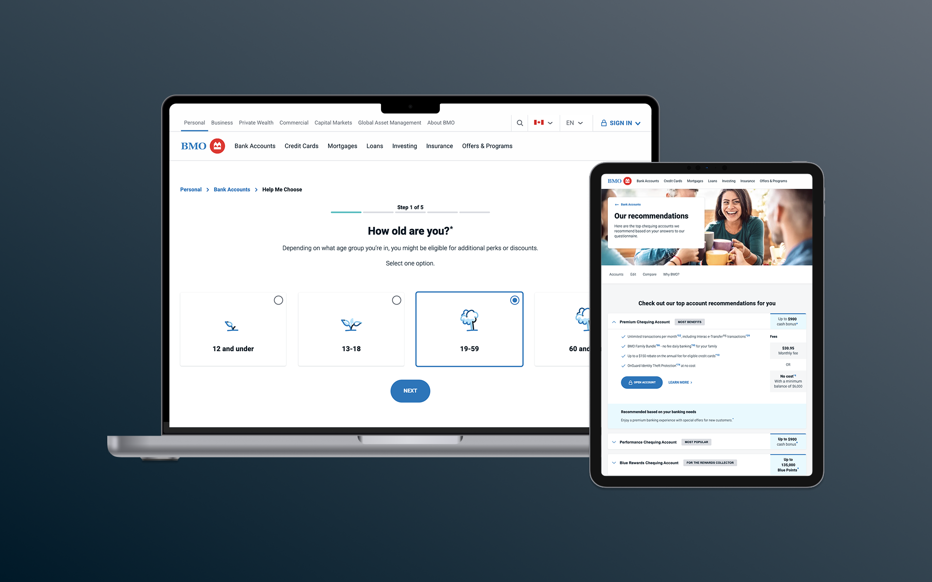
I helped lead the design of Help Me Choose, transforming BMO’s standardized account-selection form into a guided experience that helps customers find the right chequing account.
The Opportunity
A better way to choose an account
BMO's existing Help Me Choose experience relied on a standardized form. For customers, we wanted to make finding the right account easier and more engaging. For the business, we saw an opportunity to modernize the experience while increasing engagement, click-through and ultimately account openings.
We had evidence to support a different approach. BMO's personalization team found that interactive experiences resulted in higher click rates, page views and new accounts, while competitive research helped us understand how other Canadian banks were approaching guided product selection.
Instead of simply redesigning the form, we decided to rethink how customers choose.
The Experience
From five simple steps to personalized recommendations
Rather than asking customers to compare accounts upfront, we designed a five-step journey that learned about their needs first.
I worked alongside two other designers to shape and refine the experience, focusing on making each step easy to understand, quick to complete and useful in narrowing down the right accounts.
The Recommendation
Turning answers into relevant accounts
Completing the five steps wasn't the end of the experience. We needed to turn what customers told us into recommendations they could easily understand, compare and act on.
Based on their answers, customers received a set of relevant chequing accounts, with the strongest match surfaced first. I worked on the recommendation experience, refining the layout and hierarchy to make it clear why an account was recommended, what it offered and what to do next.
The design went through several iterations as we balanced the amount of account information customers needed with an experience that remained easy to scan.
Making recommendations flexible
We also considered what would happen if customers wanted to reconsider one of their answers after seeing the results.
Rather than making them restart the five-step journey, we designed an editing experience that let customers review the answers behind their recommendations and change individual responses.
Selecting an answer opened it for editing, while everything else was preserved. Once updated, customers could return to their recommendations based on their revised answers.
From Design to Production
Staying involved through launch
My work continued as the experience moved into development. I completed responsive designs, incorporated stakeholder feedback and refined areas of the experience that weren't working as intended.
As engineering brought the designs to life, I reviewed the implementation as sections were completed, using the approved designs as our source of truth to identify visual and interaction issues and work through them with the team during design QA.
Staying involved throughout development helped ensure the experience we designed was the experience customers received.
Discovery
→
Research
→
Design
→
Prototyping
→
Handoff
→
QA
→
Launch
→
Discovery → Research → Design → Prototyping → Handoff → QA → Launch →
The Outcome
A new way to help customers choose
Help Me Choose launched as a new way for customers to find the right chequing account—moving from a standardized form to a guided experience built around their needs.
While I don't have access to post-launch performance data, we delivered on the experience we set out to create: a simpler, more engaging path from uncertainty to personalized account recommendations.